Accessibility Redesign & Annotation for City Tech OpenLab
A WCAG 2.2 AA audit, redesign & annotation of the City Tech OpenLab, focusing on cognitive and keyboard accessibility for over 20,000 users, prioritizing minimal development resources.
Accessibility
Education Tech
Responsive
Accessibility Annotation
WCAG
TEAM
Chloe Zhang (me)
Sophia Liu
ROLE
Accessibility & UX Designer
SKILLS / TOOLS
Figma/FigJam, WCAG, Screenreader, VoiceOver, Inspect, Excel
TIMELINE
Sept – Dec 2025 (3 months)
Use the chevron on the right to preview the accessibility annotations we did.
00 Problem
CITY TECH OPENLAB WEBSITE NEEDS TO BE ACCESSIBLE
The OpenLab is an open community space built using WordPress and BuddyPress to support open education, community, and collaboration for students, faculty, and staff. They had an aging homepage that was failing to meet modern accessibility standards. The legacy design suffered from cognitive overload, inconsistent screen reader sequencing, and several violations of WCAG 2.2 Level AA.
With limited resources, the client needed prioritized, actionable recommendations that could be implemented immediately while planning for a larger, future-proof redesign.

THE GOAL
To audit the OpenLab homepage against WCAG 2.2 AA and provide a tiered set of design and development recommendations to ensure the platform is accessible to all students, faculty, and staff, prioritizing the highest-impact fixes first.
01 Solution: Accessible Design Recommendations
We developed mockups to visualize the Tier 1 and Tier 2 changes. The core of the redesign focused on enhancing clarity and reducing distraction on mobile devices, where most students access the platform.
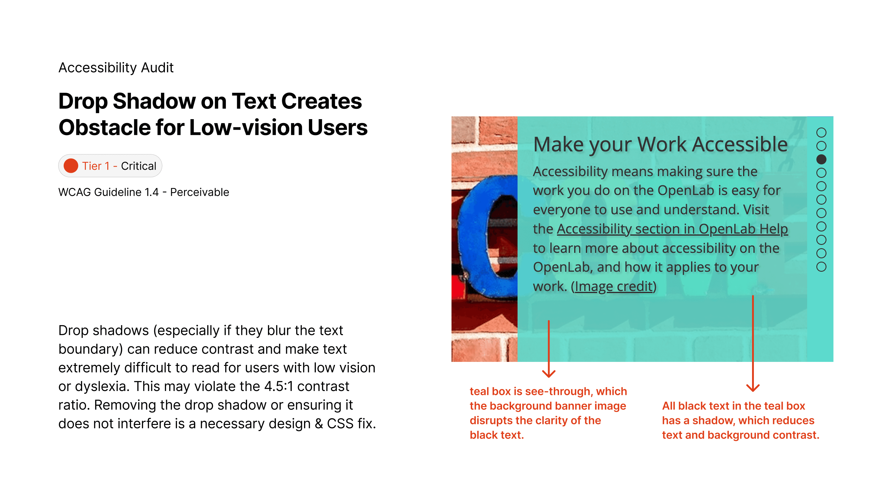
Allow Users to Pause Banner
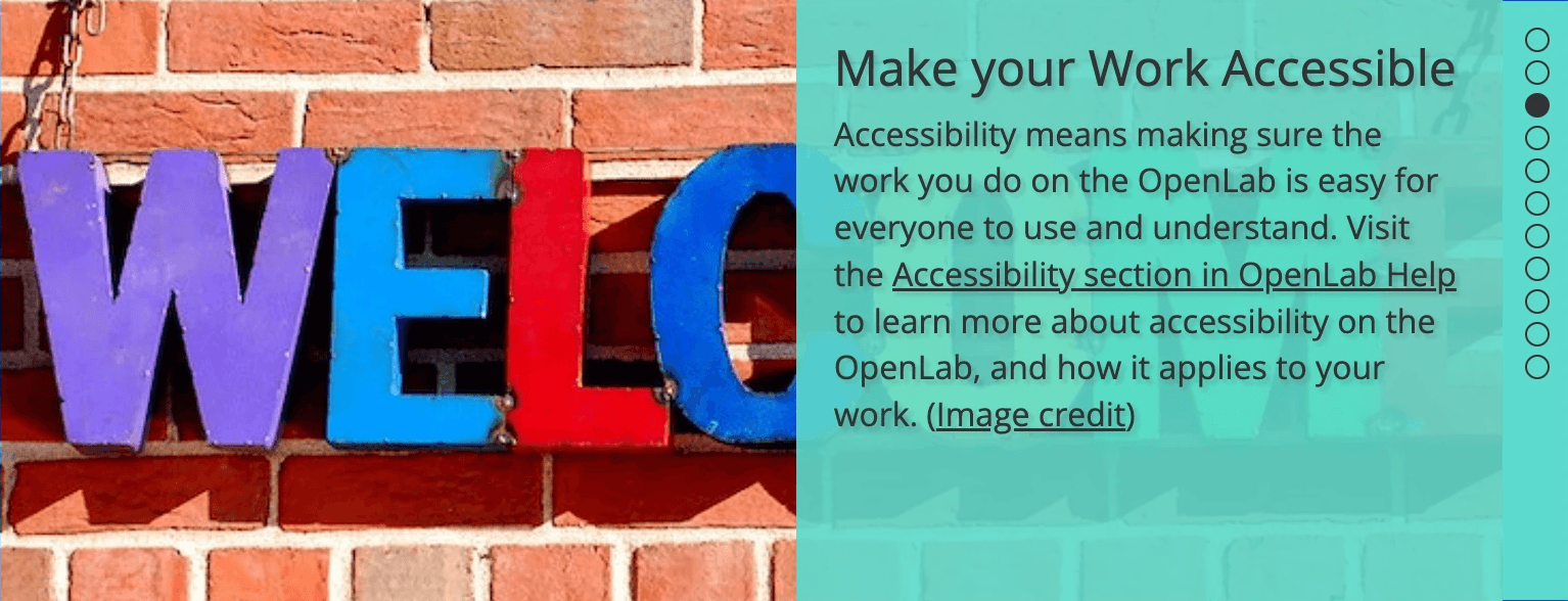
Original
Currently, the banner autoplays, with the opaque teal box blocking half of the background, and all text has shadow that negatively affects readability.
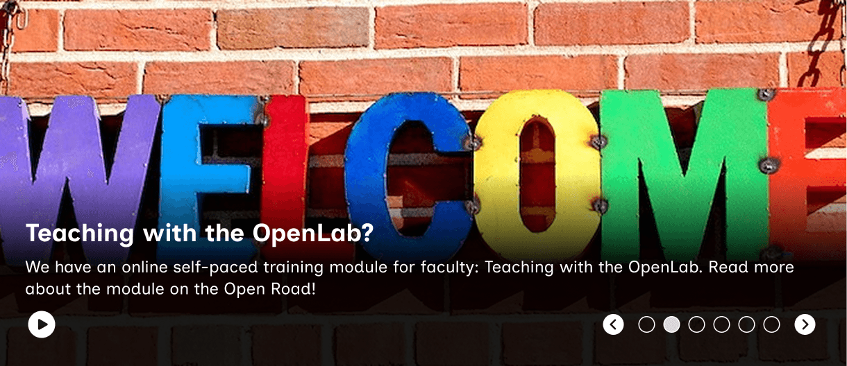
Recommended accessible design
Adding a play/pause control helps user with cognitive disabilities navigate through the Home Page, and helps any user who simply do not like too much moving graphics!
Forward and backward Chevron are also provided for another level of user control
A dark overlay is placed behind white text for better readability.
Added Focus States for “Who’s Online” Section
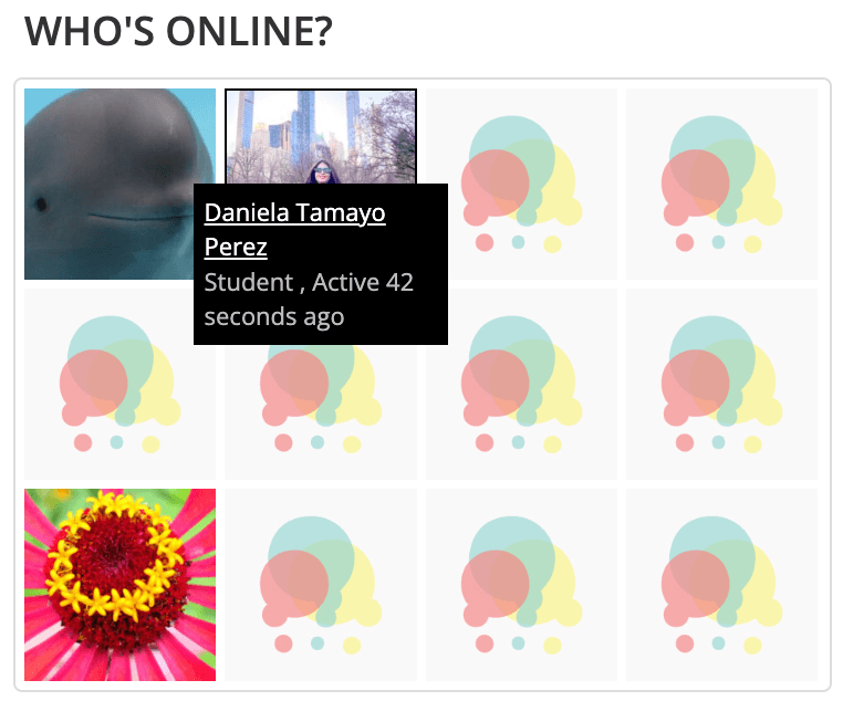
Original
Currently, when tabbing through the Home Page, no focus states show up for this section, even though each user square is interactive. The Hover design for user information also blocks the Avatar, and is not screenreader friendly.
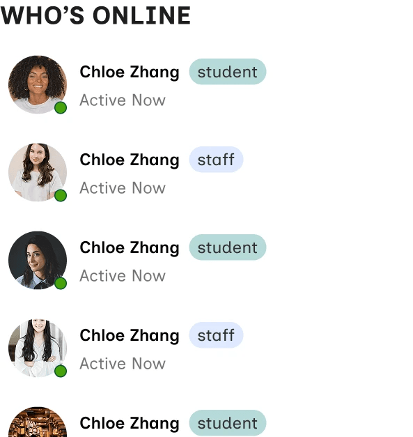
Recommended accessible design
Glanceable, rectangular cards with the reading order of user name > user type > and activity status.
A green dot is also used to showcase activity status at a glance.
The list is dynamically ranked to display currently active users at the top.

Hover state

Focus state
Making Forms Accessible
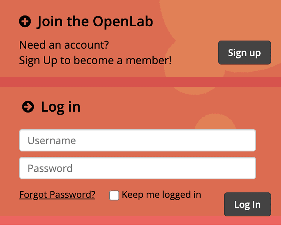
Original
Form hints "Username" & "Password" functions in the absence of form labels
Form hints disappear as users start typing in the forms
2 primary CTAs appear in close proximity
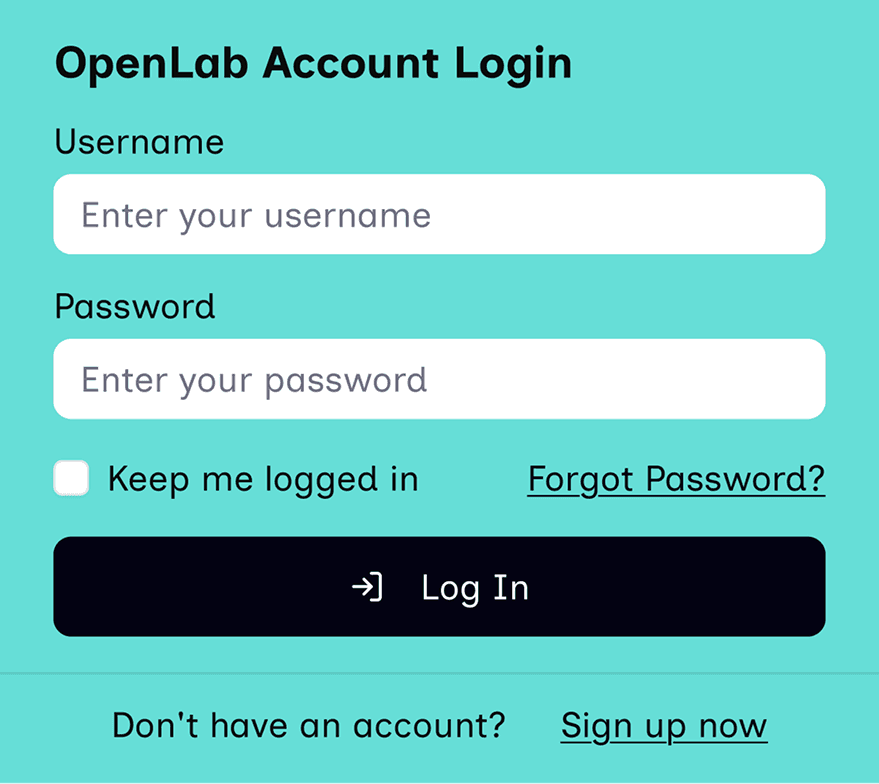
Recommended accessible design
Added proper form label
Solid color background to reduce visual load (yes, this teal adheres to WCAG 2.2 AA)
1 prominent CTA that is full-sized for a smoother mobile adptation
Links with Improved Copy and Label

Original
Only the (>) con is used to indicate “see all”
Screen reader does not announce “see all courses”

Recommended accessible design
Use (->) icon AND text to indicate the “see all” functionality
Use clear copy, “See All Courses” to avoid confusion
LOGICAL READING ORDDER
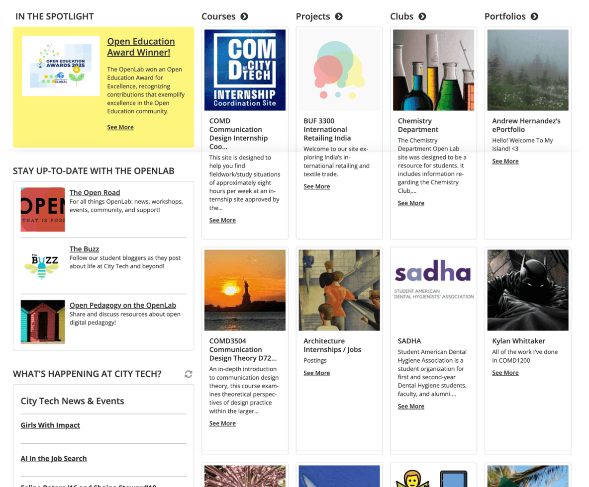
Original
Followed a vertical up to down reading order that requires a lot of scrolling, and makes each cards look narrow and cramped.

Recommended accessible design
Using horizontal carousels to avoid excessive scrolling up and down
Using 3 cards instead of 4 helps reduce cognitive load
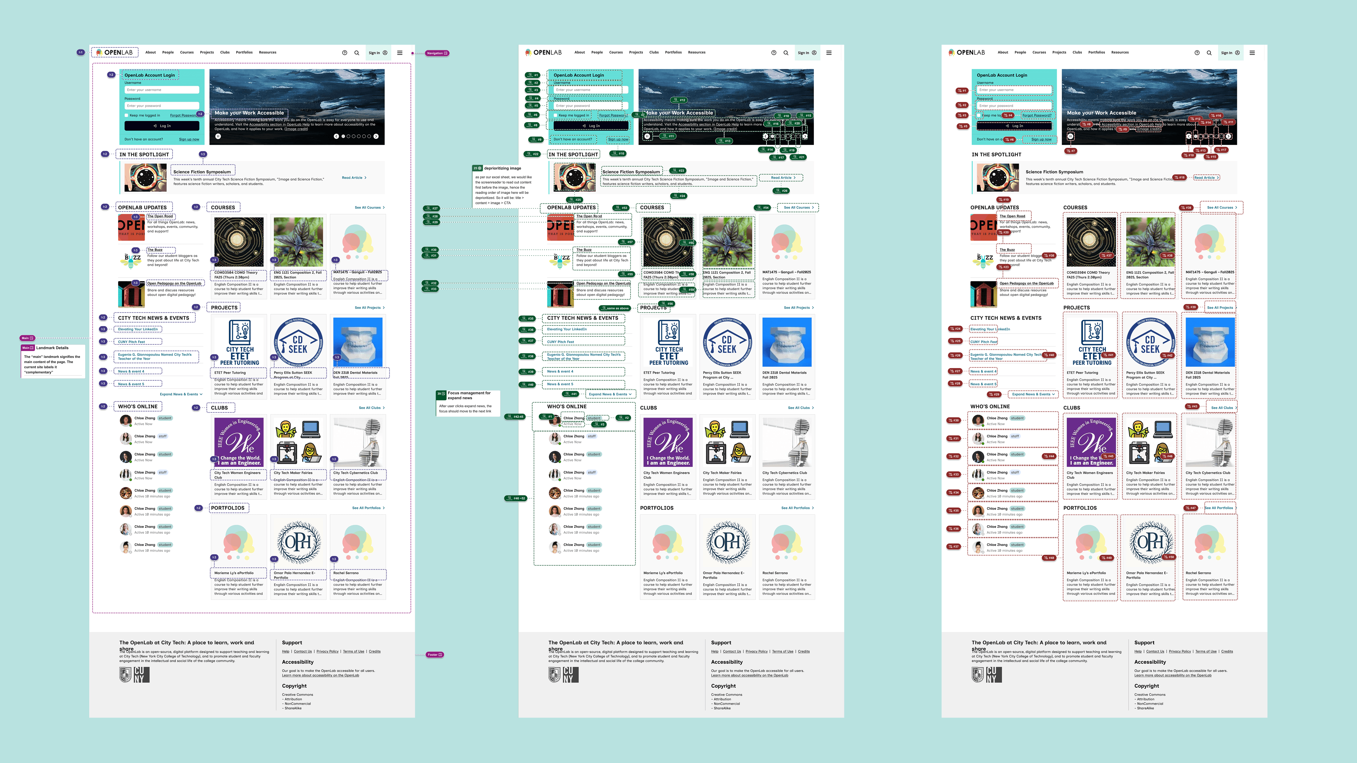
ACCESSIBLE DESIGN ANNOTATIONS
We also annotated headings & landmark, tab order, screenreader order, screen reader content, image/non-test content on a Figma file, so that our hand-off with CityTech's developer can be easy and smooth.
Skip down to see annotations
02 Research & Discovery
Target Users
Our primary focus was on users who rely on assistive technology, including those with:
Cognitive disabilities: users who struggle with complex layouts, high visual density, and rapid motion (e.g., users with ADHD or Autism, like the persona Trevor we previously discussed).
Motor Impairments: Users who rely on keyboard navigation or switch controls.
Low Vision: Users who require proper text contrast and large, clear focus states.
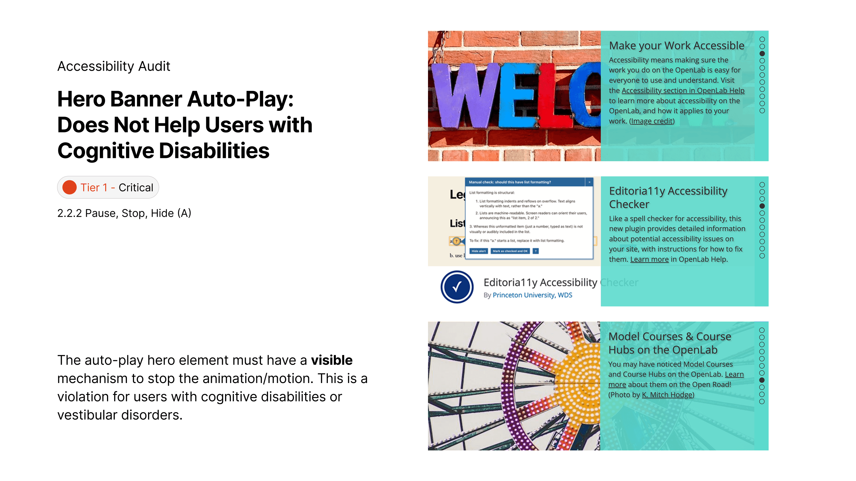
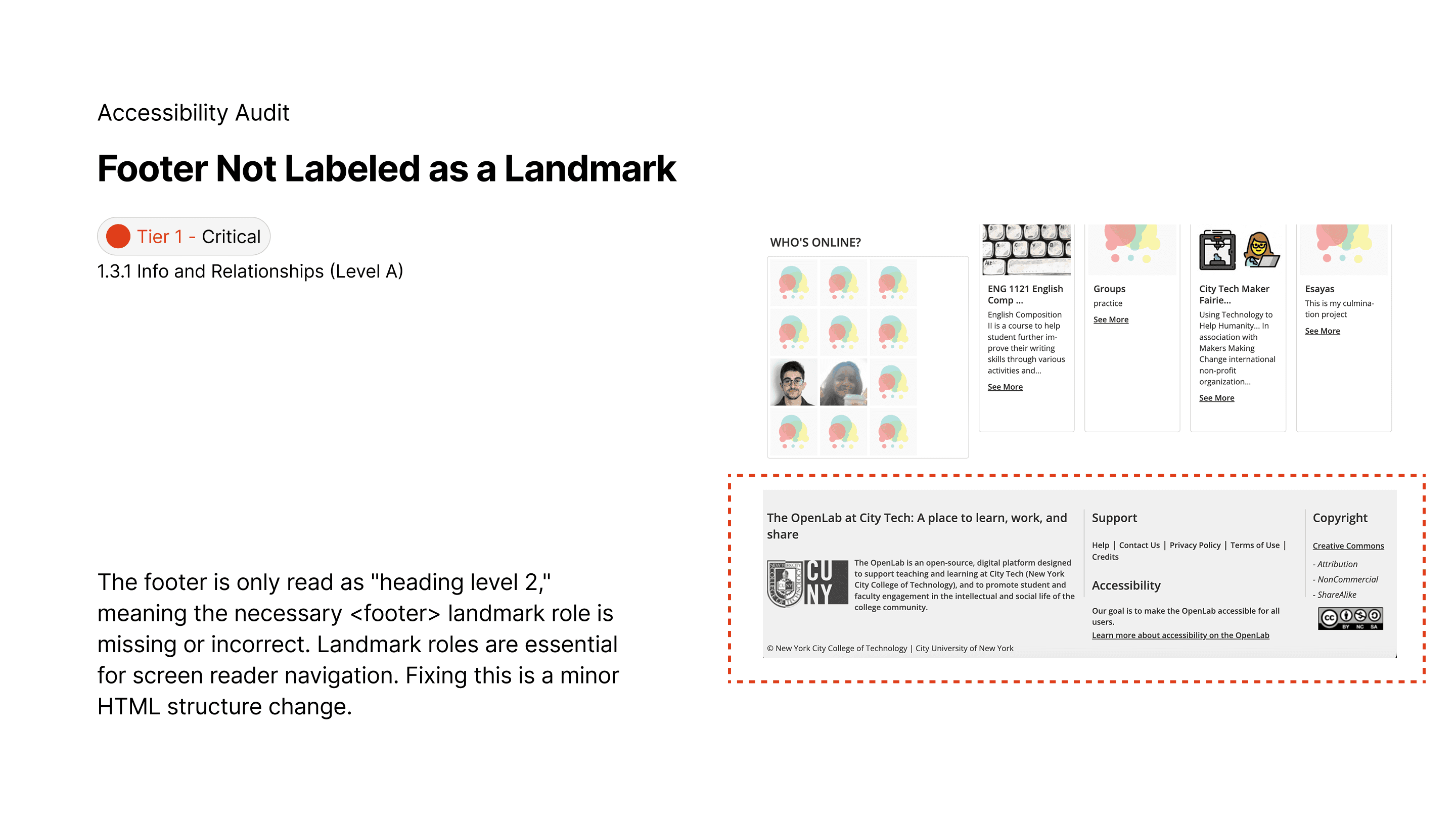
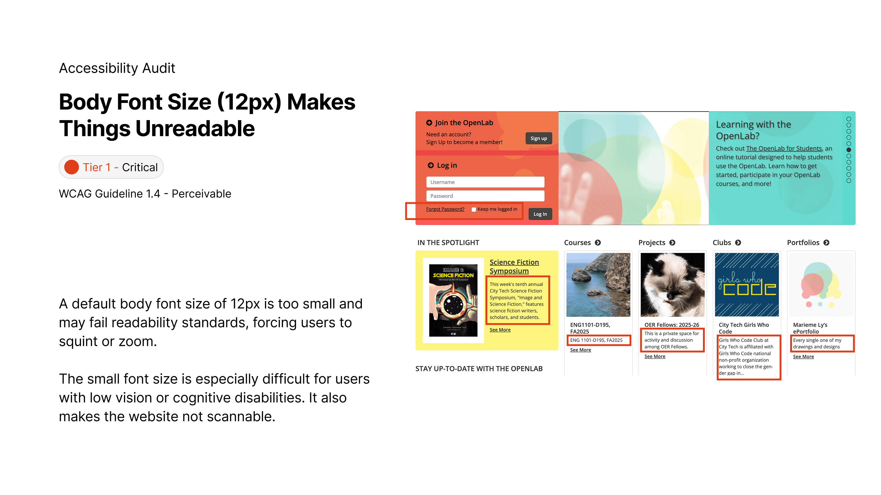
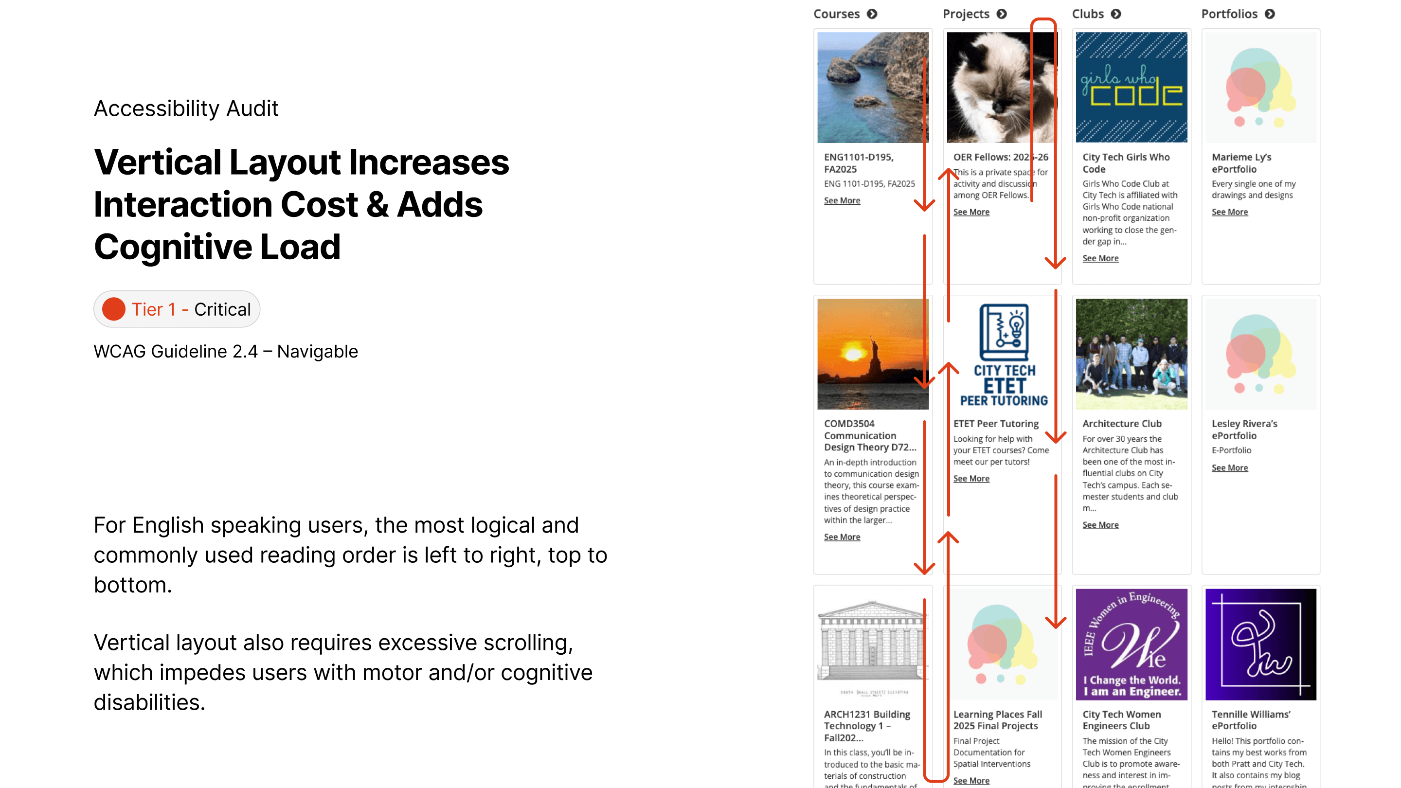
ACCESSIBILITY Audit
Swipe through or use the arrow on the right to explore what we found out during our initial website audit.


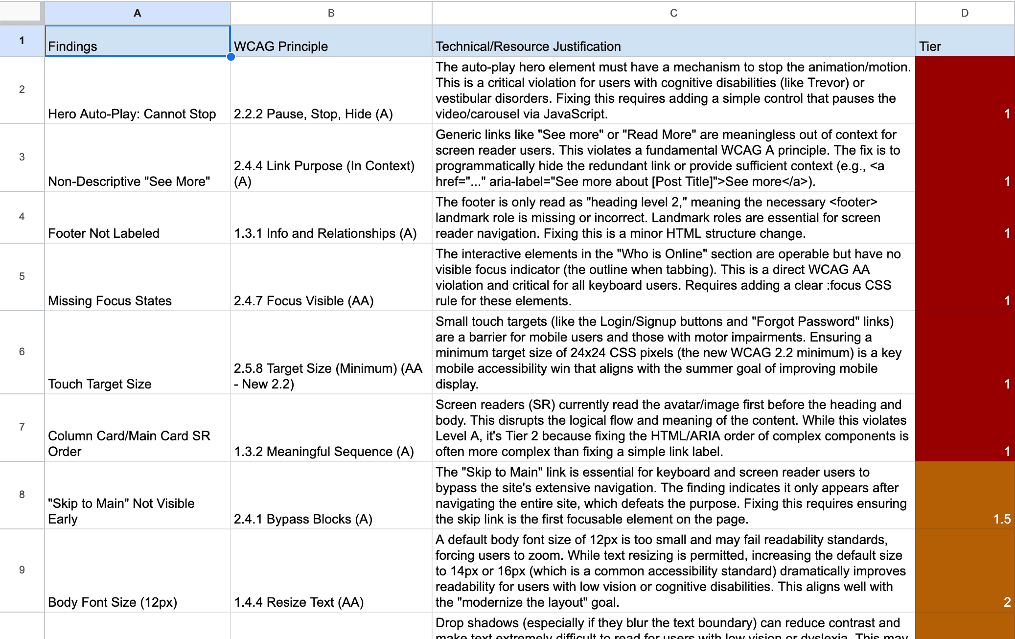
03 Solution Prioritization
We structured our recommendations into three tiers to align with the client’s limited resources and long-term roadmap. Check out the prioritization sheet!
Tier 1: Critical/Urgent Fixes (WCAG Level A)
These fixes required minimal development effort but provided the maximum accessibility impact.
Tier 2: Important/Medium-Term Enhancements (WCAG Level AA)
These recommendations were integrated into the planned "minor design changes" for the summer.
Tier 3: Long-Term/Nice-to-have Improvements
This tier informs the vision for the next major redesign cycle.
04 Redesign Adhering to WCAG
BEfore & AFter
Based on our recommendation, we provided a redesign of the Home page for our client to use.

New Font
We also suggested a new font that have a more readable and grounded style. Inclusive Sans is a text font designed for accessibility and readability. It is inspired by the friendly personality of contemporary neo-grotesques while incorporating key features to make it highly legible in all uses.

Inclusive Sans
ABCDEFGHIGKLMNOPQRSTUVWXYZ
ABCDEFGHIGKLMNOPQRSTUVWXYZ
12345567890
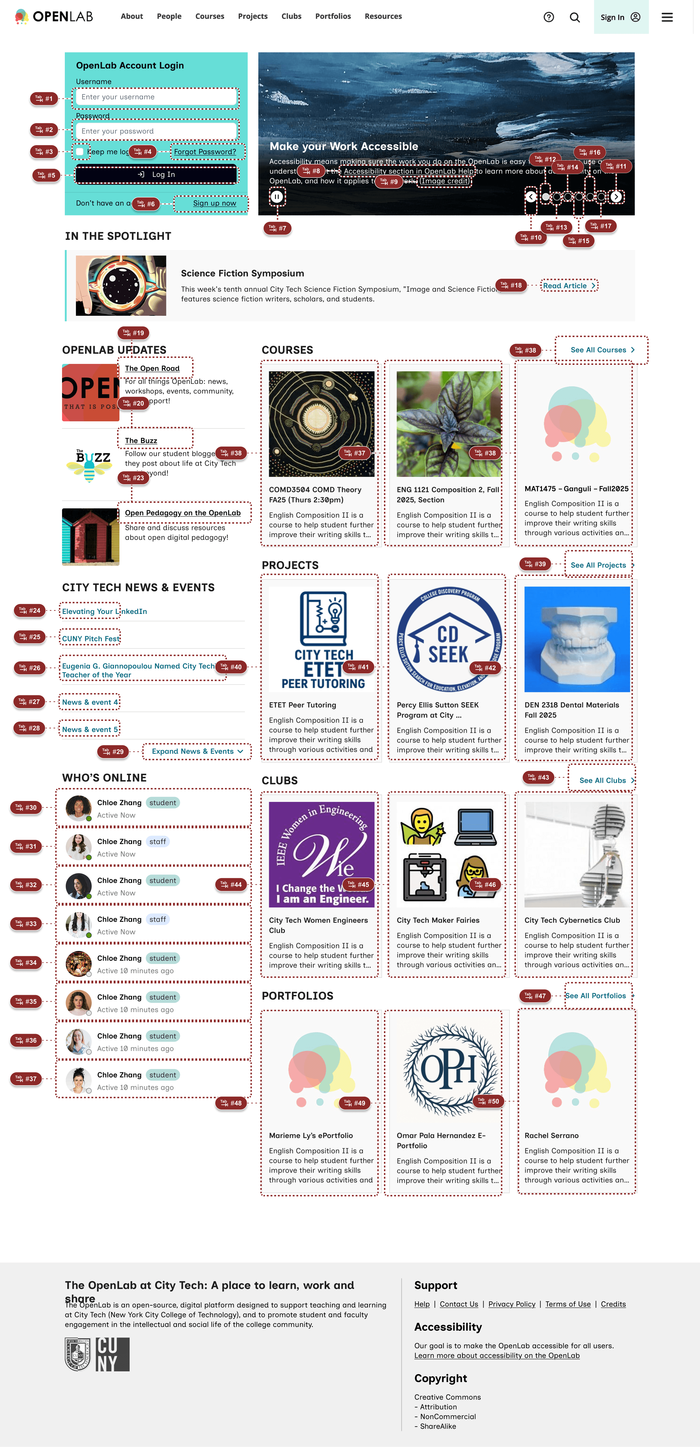
05 Accessibility Annotation for Hand-off
Below few screens display how we hand-off accessibility designs to a developer, we annotated: headings & landmark, tab order, screenreader order, screen reader content, image/non-test content.
Tab order
We annotated the most efficient and thorough tab order that keyboard users can follow to navigate the Home page.
Screen reader order
We annotated the logical order how a screen reader should be reading out the Home page content.
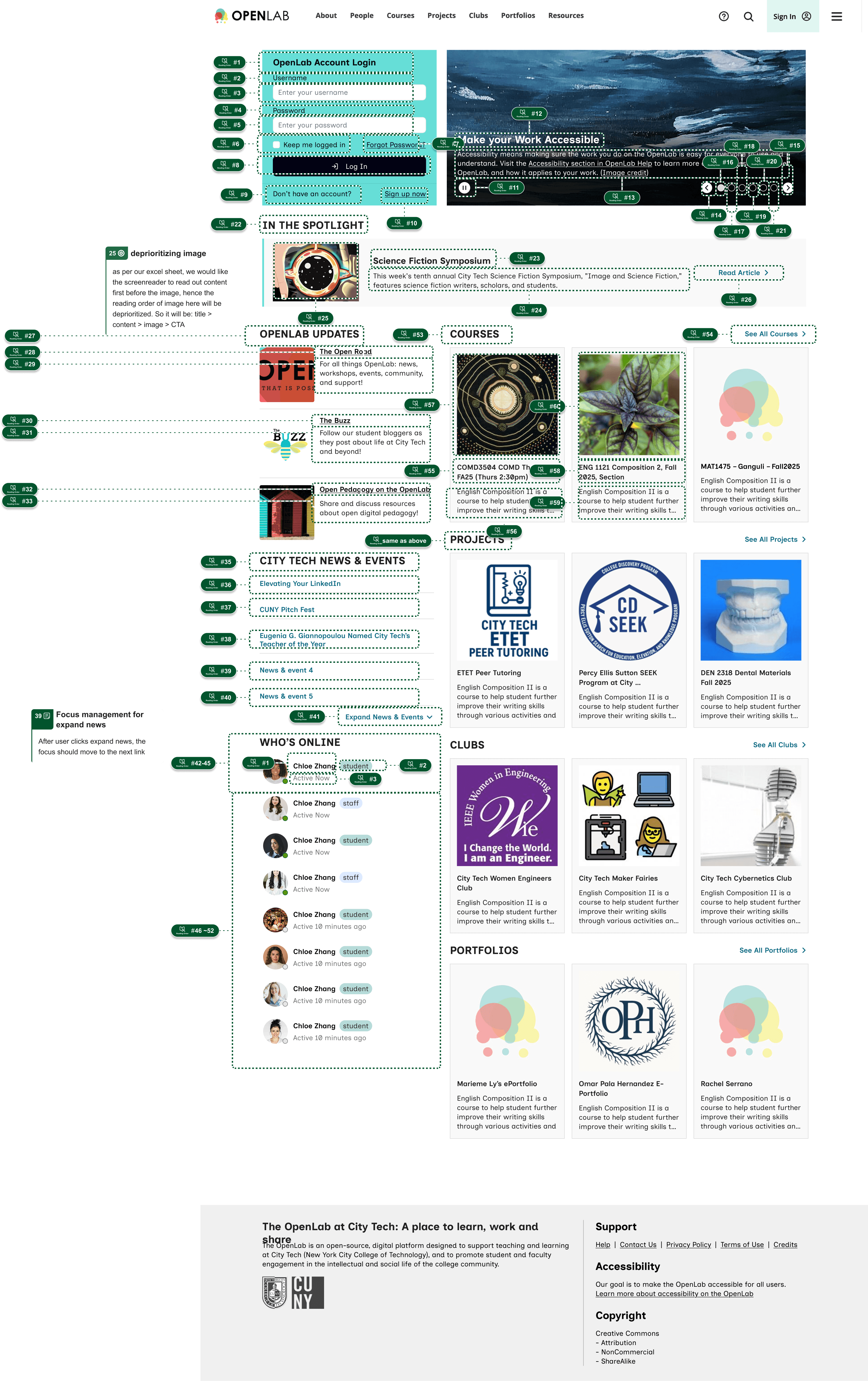
image & Non-text description
We used symbols & icons to indicate whether an image/non-text content needs description:
Star means: decorative, do not describe
Yellow triangle alert means: interactive, needs description
Orange circle alert means: meaningful, needs description
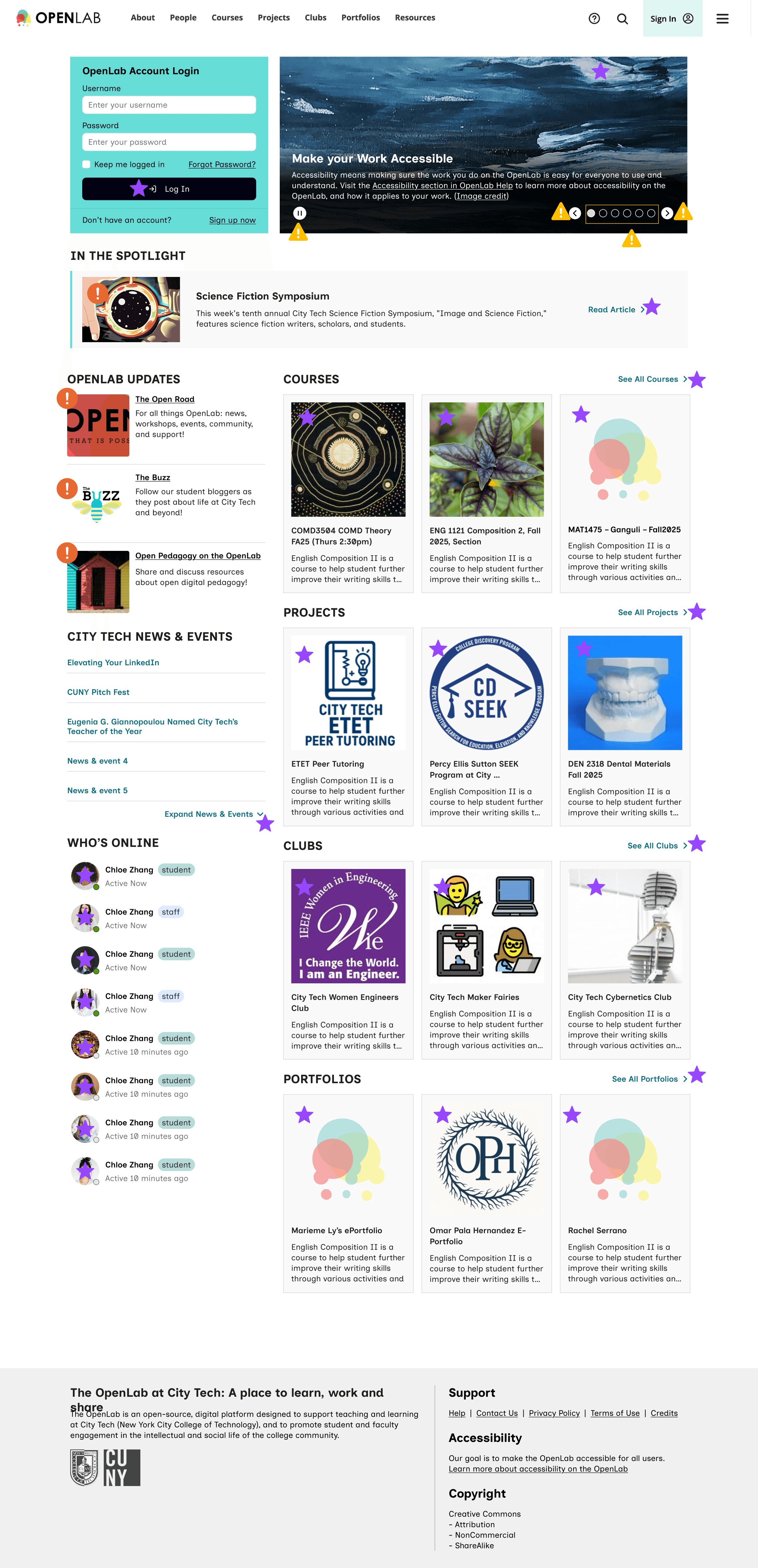
Headings and Landmarks
Heading and Landmark roles are essential for screen reader navigation. We annotated H1-3 and made sure nothing is skipped. Navigation bar, Main content, and footer are also annotated.

Link to Annotated Figma File
06 In Retrospect
IMPACT
We delivered a comprehensive, prioritized guide that empowered the client's small development team to immediately address critical, low-cost accessibility issues, aligning their summer development efforts with legal compliance (WCAG 2.2 Level AA) and improved user experience. The Tier 3 recommendations now serve as the foundation for future grant applications and full site redesigns.
Created a recommendation slide-deck and presented to the City Tech OpenLab team
Annotated the Home Page accessibility features when handing-off
Redesigned the Home Page to visualize our accessibility recommendations
MY LEARNINGS
The role of annotation for devs
Accessibility design fundamentally changes the hand-off process, elevating design annotations from aesthetic notes to essential technical specifications. This project underscored that a successful accessible design relies on constant, clear communication with the development team.
Context is King for Prioritization
The client's resource constraints were the most significant design factor. Prioritizing low-effort, high-impact fixes (like changing an ARIA label or fixing a focus state) provided far more value than proposing a total redesign.
