Design System for Pratt Institute Student Service Platform
Designing and testing the design system for a student & faculty facing website for Pratt Institute.
Design System
SAAS
UI Kit
2025
My Team:
Chloe / Meng / Ivory
Tools:
Figma / Zeroheight
Timeline:
Jan 2025 –– May 2025

01 Solution
Introducing the OnePratt Design System
OnePratt design system is built for the OnePratt website, to help, support and unify the online experience for students at Pratt Institute. It includes a UI Kit, documentation site and a pitch deck.
Figma UI Kit
Published Pratt UI Kit; available to download and use.
Link to Figma
Design System
Living documentation on Zeroheight, for Pratt designers, engineers, and students.
Read on Zeroheight
Design System Pitch Deck
The final pitch deck to get everyone on board. Presented on May 2025.
Link to Figma Deck
02 Problem Space
What is The OnePratt Website?
OnePratt is Pratt Institute’s centralized digital portal that gives students, faculty, and staff access to essential campus services, tools, and resources. It includes:
Course registration and class schedules
Financial aid and billing
Campus announcements
Academic advising tools

To redesign or not to redesign, that is a question!
Our first question was: Should we start this design system project off by redesigning the OnePratt website? Redesigning it means stretching the project scope.

We listened to classmates complaint about our school website.
We asked around the students of Pratt Institute to see how the students truly feel about this website, and we received many negative feedback on the current design.
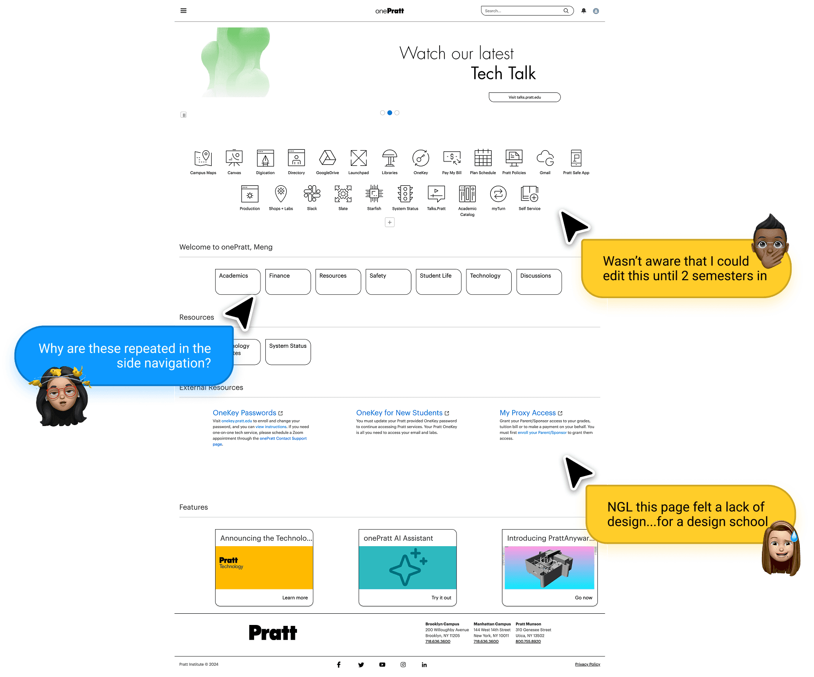
We did an autopsy on OnePratt: UI Audit.
To make sure we can make an informed decision about whether to redesign or not, we did a UI audit across every UI elements, from the smallest atom, molecule to complicated organisms following the Atomic Design Framework.
We checked for inconsistencies, repetitions, usability issues and accessibility. The audit showed clear inconsistencies and usability gaps—prime material for a re-design and design system intervention.


See full UI element audit on Figma
03 Redesign
We redesigned the OnePratt Website for aesthetics and functionality first.
Therefore, we decided to do a re-design for OnePratt before starting on the actual design system. For the re-design, we aimed for a light-weight style that adheres to the Pratt Institute Visual Design Guidelines, and showcases a dashboard aesthetic to communicate OnePratt's nature.

04 Design Tokens
Tokens are really the unsung heros: colour, type, spacing.
To have a good design system foundation, we wanted to make sure we have an intuitive Token System so that both designers can make global changes across the design, and developers can use tokens to ship products faster.
Our tokens apply to color, spacing and typography.

Our token structure uses a 3 tier pyramid structure, with Brand as the base level, alias in the middle and mapped as the top level.
Using color as an example, the Brand level includes the hexcode, the Alias level is the name we associate the color with, and the Mapped level is how the color is used.

The Mapped Token breakdown of a primary button.

The Mapped Token breakdown of a secondary button.
Once we embraced tokens, everything started clicking—from alignment to accessibility. They became the building blocks of our entire design system.

Our team figuring our how to give our Token intuitive names.
We used Figma variables to store Tokens, so that users can easily call out any tokens as they design.
05 UI KIT
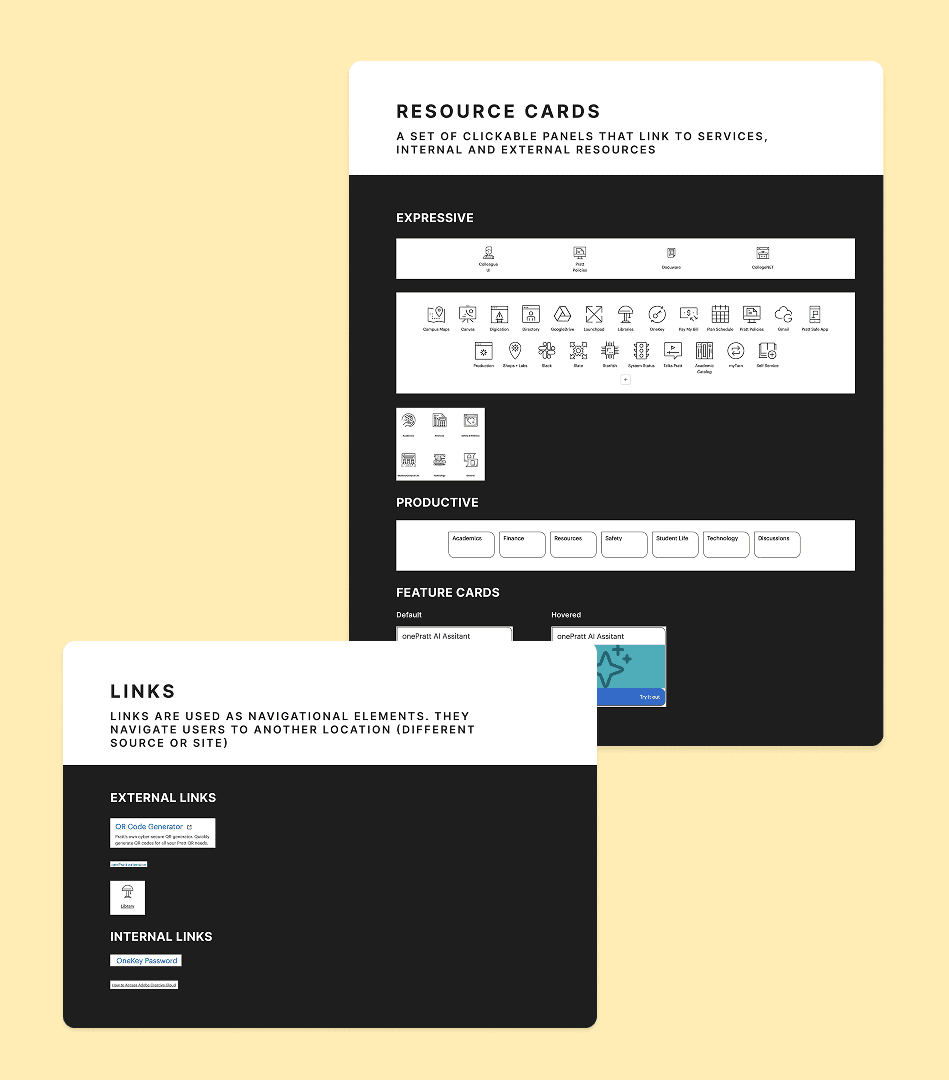
Piecing the UI Kit puzzle with essential components.
We assembled a drag-and-drop UI kit that’s developer-friendly and design-approved. Each component is reusable, accessible, and styled with care.

All stages of buttons

All stages of cards

Customisable templates

Banners & pagination

Pre-built card templates

Navigation

Header bar

06 User Test
We user-tested the UI Kit to make sure it is intuitive.
To make sure our UI Kit actually worked, we put it in users’ hands. We asked 6 users to design the Home Page and Support Page (our re-designed version) using our Figma UI Kit. While they design, we asked them to think-out-loud.


Our user testing in progress…
6/6 participants successfully recreated the designated pages:
3/6 participants expressed confusion when finding the "Panel" components:
6/6 participants thinks our Token systems are easy to use:
07 Iteration
We made iterations of the UI Kit based on the user testing results.
After hearing user's thoughts in the testing process, we teaked our design! We got feedback specifically on two things:
Iteration 1
Re-naming "Panel" to "Cards"
Since users have troouble finding our Panel component, we changed the name to Cards, so this is universally recognized by designers.
Iteration 2
Create a component with multiple cards to recreate sections easily.
For the ease of designing and developing, we added a new section template just for cards, so that users can simply replace website copy instead creating sections from scratch.
Before iterating, we only have the drag and drop section template.
After iterating, we added this new card section template for users.
08 Documentation of Design System
Read this part if you also love Design system documentation.
Design systems are cultural changes disguised as UI Kits. Design system is more than just the UI Kit - the documentation is equally important on making our system usable and scalable.
We organized everything clearly in Zeroheight so devs and designers can actually understand what to do with the design system.


Our documentation site includes many aspects:

Get started
Spoon-feeding users on how to set-up the design system.

Tokens & foundations
How we created tokens and how to use them.

Components & Usage
What are the components and how to use them.

Accessibility
How to design with accessibility using the design system.

Get help & Social
How to reach out to us if users have feedback.

Resources
For developers and/or first time dersign system users
09 Pitch Deck
Our team became sales for one day: pitching the Design System to developers
We stepped into our sales shoes to pitch the OnePratt Design System to an audience of developers and (potential) designers, because the current IT Team maintaining the OnePratt website does not have a designer. Our goal: show them that adopting a design system is really beneficial to their team, and the end-users (students) in the long run.


Our team of 3 on the day of pitching our design system.
10 What We Learned
Design systems are cultural changes disguised as UI Kits.
We learned that building a design system isn’t just about UI Kits — Never underestimate the power of documentation.
Intuitive component naming is so important.
Information architecture for a documentation site is also essential for usability, as users need to find and locate what to do with the UI Kit.
And again…Design systems are cultural changes disguised as UI Kits.
Figma UI Kit
Published Pratt UI Kit; available to download and use.
Link to Figma
Design System
Living documentation on Zeroheight, for Pratt designers, engineers and students.
Read on Zeroheight
Design System Pitch Deck
The final pitch deck to get everyone on board.
Link to Figma Deck
